

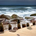
G E G E N - W E H R
. . . in bunt für die anderen.
Comments
21


Information
| Sections | Natur: Brandung Natur: Meer & Strand Natur: Watt |
| Folders | K Ü S T E |
| Views | 7,067 |
| Published | |
| Language |

|
| License |
Exif
| Camera | ILCE-7RM3 |
| Lens | Sony FE 24-105mm F4 G OSS (SEL24105G) |
| Aperture | 13 |
| Exposure time | 0.8 |
| Focus length | 28.0 mm |
| ISO | 50 |
Appreciated by


Embed photo
Include in a comment, a description or a message to show this image.
Link copied...
Click on the link and use the key combination "Ctrl C" [Win] or "Cmd C" [Mac] to copy the link.
Share in Messenger
Insert the following link into the comment field of the desired conversation in Messenger using 'Paste' to send this image in the message.
Link copied...
Click on the link and use the key combination "Ctrl C" [Win] or "Cmd C" [Mac] to copy the link.
elorenzen 27/11/2023 12:58
sehr schöne ArbeitVG Erwin
Wilhelm Staatz 04/10/2023 21:44
Super Aufnahme mit dem Schärfepunkt auf dem dominanten Vordergrund. VG WilliAlfons Fries 16/07/2023 17:55
Die Version in Farbe gefällt mir sehr gut.Auch deine Aufnahmetechnik ist gut.
Gruß Alfons
Momente HH 14/07/2023 17:27
Danke für die farbige Variante ,die dir erstklassig gelungen ist
lg gine
Dieter Golland 14/07/2023 15:59
Sehr schön gestaltete Aufnahme.Gruß Dieter
Ulla Moswald 14/07/2023 8:51
Ich nehme Farbe! Tolle Staffelung der Elemente und klasse Farbkontraste des warmen Sandtons zum kühlen Meer.LG Ulla
Susanne Dropmann 13/07/2023 22:01
Ich gehöre bei dieser Aufnahme dann zu den anderen, gefällt mir sehr in Farbe, tolles LichtViele Grüße Susanne
christ.a 13/07/2023 21:58
Hier finde ich die Farbvariante noch besser. Die leuchtenden Komplementärfarben verstärken den Kontrast und die Dynamik.LG Christa
AngelikaE. 13/07/2023 21:36
Mir gefällt auch bunt besser, da die Farben so harmonisch wirken und dadurch das Bild eine tolle Ausstrahlung hat.LG Angelika
Georg2020 13/07/2023 21:22
Ich will farbig, nicht bunt. Schließlich gab es damals Farbfernsehen. Oder halt die Bunte....
Auf jeden Fall ein super Bild! :-)
PeterR.59 13/07/2023 21:02
Ich fühle mich zu beiden Varianten hingezogen - kann mich nicht festlegen ob ich mich zu den einen oder den anderen zählen soll. Beide Varianten sind m.E. sehr gelungen.VG, Peter
Wim Schuppe 13/07/2023 20:57
In speziell diesem Bild ,würde ich mich für "bunt" entscheiden...Es wirkt..."lebendiger"....."ausdrucksvoller"....mehr Druck im Bild.....
Es hat eine positivere Auswirkung auf den Betrachter, als in S/W......
Im Sinne des Betrachtes....Lieben Gruß Dir.....Wim
Vitória Castelo Santos 13/07/2023 20:21
Ein schöner Blick auf den Ort.LG Vitoria