
Comments
11


Information
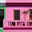
| Sections | Travel: Cape Town Motive: Fenster & Türen Motive: Fassaden |
| Folders | Bo-Kaap |
| Views | 5,971 |
| Published | |
| Language |

|
| License |
Exif
| Camera | ILCA-77M2 |
| Lens | Sony DT 16-50mm F2.8 SSM (SAL1650) |
| Aperture | 8 |
| Exposure time | 1/750 |
| Focus length | 50.0 mm |
| ISO | 200 |
Appreciated by


Embed photo
Include in a comment, a description or a message to show this image.
Link copied...
Click on the link and use the key combination "Ctrl C" [Win] or "Cmd C" [Mac] to copy the link.
Share in Messenger
Insert the following link into the comment field of the desired conversation in Messenger using 'Paste' to send this image in the message.
Link copied...
Click on the link and use the key combination "Ctrl C" [Win] or "Cmd C" [Mac] to copy the link.
Cecile 18/04/2024 13:12
Typisch Bo-Kaap die Farben und gelungen der Bildschnitt.Gruß nach SA
Elfi C.
kirbreton 19/09/2023 21:18
Ganz nach meinem Geschmack . . . in puncto Farbfotos. Mein Haus lasse ich dann doch lieber in Weiß ;-)LG kirbreton
Alfi54 18/09/2023 15:22
bei dieser Farbwahl haben die Eigentümer sich bestimmt abgestimmt ... muss man mal machen, die Kombi ... LG AlfBastian Kienitz 16/09/2023 20:51
jetzt müsste dort jemand im Hawaihemd stehen, das wär der Hit +++Ruth U. 16/09/2023 19:38
Total klasse ist das, ich mag die Farben und die Bildgestaltung ist fantastisch.LG Ruth
Zina Heg 16/09/2023 9:10
Wow, das finde ich super! Grosse Klasse, dieser Ausschnitt, die Farben und die perfekte Ausrichtung!LG, Zina
Iris Herzog 15/09/2023 19:08
Gefällt mir sehr - schöner Schnitt, tolle Farben.LG Iris
Andreas Rode 15/09/2023 14:11
Die Geometrie, die Farben, die Bildaufteilung.... top gemacht !Jok5 15/09/2023 13:45
Ein cooles Motiv, klasse gesehen und präsentiert, lG JosefGerd Ka. 15/09/2023 9:28
Das ist mal farbenfroh! Pretty in Pink sozusagen ;-))Viele Grüße
Gerd
Hellmut Hubmann 15/09/2023 9:23
Schöne, flächige Farbkombination, optimiert durch die Palme(n) als Kontrast.