
Comments
27


Information
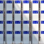
| Sections | Motive: Formen Motive: Flächen Motive: Alltagsdesign |
| Views | 10,658 |
| Published | |
| Language |

|
| License |
Appreciated by


Embed photo
Include in a comment, a description or a message to show this image.
Link copied...
Click on the link and use the key combination "Ctrl C" [Win] or "Cmd C" [Mac] to copy the link.
Share in Messenger
Insert the following link into the comment field of the desired conversation in Messenger using 'Paste' to send this image in the message.
Link copied...
Click on the link and use the key combination "Ctrl C" [Win] or "Cmd C" [Mac] to copy the link.
noblog 27/01/2019 13:58
Klasse AufnahmeDir einen schönen Sonntag
LG Norbert
Robi H. Löwy 15/11/2018 18:15
Schon seltsam, dass meine Augen die Schliessfachnummern abtasten, um zu sehen, ob die Reihenfolge stimmt. Sie stimmt. War auch nicht anders zu erwarten. Es ist ja auch verblüffend, wie detailreich Dein grafisch attraktives Bild ist, das mir ausgezeichnet gefällt, da es in seiner Schlichtheit überaus angenehm aus dem üblichen Rahmen fällt und dadurch auf- und gefällt. Zumindest mir.noblog 05/05/2018 18:23
klasse gezeigtLG Norbert
Michael H. Voß 29/04/2018 10:29
Tolle grafische WirkungLäuft man 100mal dran vorbei, ohne zu merken, was das für ein schönes Motiv ist!!!
Du nicht!!!
Gruß Michael
Hobbyfotograf_cgn 27/04/2018 13:19
Interessantes Bild, auf die Idee muss man erstmal kommen :-)norbert lampe 27/04/2018 1:16
Sehr schön ordentlich und die Sonne zeigt sich auch noch!VG Norbert
Erdbeerschorsch 23/04/2018 19:53
Phantastisch...LG Schorsch.
Christian Villain 23/04/2018 14:56
Excellente idée pour cette composition purement graphique .† Foto-Volker 23/04/2018 14:31
Die Reihenfolge stimmt!; - )))
V. G. Volker
Felix Pastor 23/04/2018 12:03
Doch doch, der Rost und die Sonneneinstrahlung sind ein guter Kontrast zur Perfektion des Bildes. Und dann ist da noch das Rhinozeros bei Nummer 46, sehr schön!Grüße, Felix
sabiri 23/04/2018 11:42
Den Rost finde ich sehr gut. Er steht im Gegensatz zu der Perfektion des Bildes was einen gewissen Spanungsbogen aufbaut!LG Gerhard
oilhillpitter 23/04/2018 7:04
Das ist ein starkes Motiv. Super. Das muss man erst mal sehen. Gruß OilhillpitterDü49 22/04/2018 22:23
Tolle Idee.Starkes Licht.
Eindrucksvoll gestaltet.
LG
Reiner
DagmarN 22/04/2018 22:18
Und alle zu.. bin begeistert.LG Dagmar
Typ27 22/04/2018 21:04
Bei Deiner Exaktheit stören sogar der Rost und die Sonneneinstrahlung.Mal wieder perfekt!
Andreas