

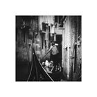
servizio gondole
archivbild, erstmals bearbeitet
venedig 2011
http://monochrome-moments.de/
Comments
15


Information
| Section | Spezial: Monochrome Fine Art |
| Folders | monochrome fine art |
| Views | 3,609 |
| Published | |
| Language |

|
| License |

|
Exif
| Camera | Canon EOS 500D |
| Lens | EF28-300mm f/3.5-5.6L IS USM |
| Aperture | 5.6 |
| Exposure time | 1/50 |
| Focus length | 130.0 mm |
| ISO | 400 |
Appreciated by


Public favourites


Embed photo
Include in a comment, a description or a message to show this image.
Link copied...
Click on the link and use the key combination "Ctrl C" [Win] or "Cmd C" [Mac] to copy the link.
Share in Messenger
Insert the following link into the comment field of the desired conversation in Messenger using 'Paste' to send this image in the message.
Link copied...
Click on the link and use the key combination "Ctrl C" [Win] or "Cmd C" [Mac] to copy the link.
Ranunkelchen 02/11/2017 18:12
Durch den Schärfepunkt im Bild wird das verschwommene im Hintergrund zum Hingucker.Wunderbar....
Brigitte H... 05/10/2017 17:47
Ein feines kleines Werk..Monika Ramacher 04/10/2017 8:52
Supergut !!! Sofort erkannt, dass es von Dir ist !!Liebe Grüße
Moni
Frank Keller 27/09/2017 14:29
Der Zuschnitt (Rahmen und Inhalt) ist einfach überzeugend, weil das Bild dokumentiert und wenig stilisiert.LG von Frank
rschaefer 26/09/2017 21:23
Famos!LG rebecca
DK-PictureBox 26/09/2017 17:28
Klasse!LG Dörte
ando fuchs 26/09/2017 9:08
sehr !!!Marion Jäger 25/09/2017 22:19
Oha - die Perspektive und die Schärfesetzung sind ja grandios.Susanne Jeroma 25/09/2017 21:04
sehr fein schärfe/unschärfe.Anette Z. 25/09/2017 20:26
Das ist sehr stark. Dieser dunkle Zahn, der da vor der romantischen Gondelszene aus der Unschärfe sticht ist ein krasser Gegensatz. Und doch die natürliche Fortsetzung der Szene.Auch die Kontraste in Schärfe und Unschärfe sind ganz anders. Vorne helle Lichter und Lackschwarz. Hinten dominieren strahlende Grautöne.
Was ich bemängeln würde, ist die zusätzliche Schärfe auf der Wand rechts. Das unterbricht das Spiel von Vorder- und Hintergrund. Aber ich vermute mal, du hast es absichtlich da? Wäre ja kein Problem, das weichzuzeichnen. Von daher würde mich deine Absicht dahinter interessieren.
Gruß, Anette
dark soul123 25/09/2017 20:19
Super in Idee und Umsetzung.Rübe 25/09/2017 19:44
Sehr gute SchärfesetzungKlasse, das mag ich sehr
LG Kora
LAVA EIKON 25/09/2017 19:33
Na... diese Fokussierung ist klasse! Das Format und monochrom sowieso! Sehr gefühlvoll bearbeitet!LG Fabi-Karo
Woman of Dark Desires 25/09/2017 19:32
das ist starklg wodd