

Comments
5


Information
| Section | Subjects: Critique - straight and tough |
| Views | 1,527 |
| Published | |
| Language |

|
| License |
Embed photo
Include in a comment, a description or a message to show this image.
Link copied...
Click on the link and use the key combination "Ctrl C" [Win] or "Cmd C" [Mac] to copy the link.
Share in Messenger
Insert the following link into the comment field of the desired conversation in Messenger using 'Paste' to send this image in the message.
Link copied...
Click on the link and use the key combination "Ctrl C" [Win] or "Cmd C" [Mac] to copy the link.
Wim Denijs 08/10/2006 1:53
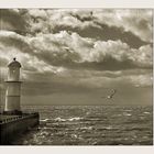
Sure , don't delete this pic Angel , He is not bad at all . About the lighthouse , this really don't disturbs me neighter , indeed Luc , an "old " feeling . Only I like to see this pic once in a real B/W , with more contrast , but I have to see it , maybe I am wrongLuc Grollie 03/10/2006 21:22
think Anastasya has a point, a wide pic showing the empty sea would speak better for it'self......as for the tilting lighthouse, I don't know, many of them stand that way after all those years facing stormy weather, gives it an 'old' feeling.
greetz,
Robert Riley 03/10/2006 19:25
I quite like it, the Gull, the sky. The lighthouse is on the tilt, and would be better wider, and I think with a bit more Contrast. Possibly some Grain.Anastasiya Ivanova 03/10/2006 10:01
The perspective of this outlook is supposed to be much wider for acquiring better and more magnifi sense of extensity. The room for the sky and the sea doesn't not in balance and be equal, also you should give more space to the left side of the lighthouse.Angel Dumitru 03/10/2006 4:38
Tank you so much, Ruud.For visiting me and for help. I'll take out the marks. You right... there's no esthetics in it. "the lighthouse is out of balance, while the horizon is straight. and looks strange to me." For me too... that's why I didn't try to make something. 'cause I don't know what to do. maibe the best thing is to take out the picture...
About composition... I see your point. But my intention was to create this "lost in space" atmosphere. Because... there is no ship to welcome...
Finally... maibe the best thing is to... wipe it. Thanks, again.