
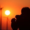
Ich fand es passend...
...in schwarz weiß
Volle Konzentration...
Klaus Degen
Comments
8


Information
| Sections | Spezial: Salzländer Nachtfotografierer Motive: Brückenbauwerke |
| Folders | Blaue Stunde /Nachts |
| Views | 2,922 |
| Published | |
| Language |

|
| License |
Exif
| Camera | Canon EOS 60D |
| Lens | Tokina AT-X 124 PRO DX 12-24mm F4(IF) |
| Aperture | 5.6 |
| Exposure time | 13 |
| Focus length | 17.0 mm |
| ISO | 200 |
Appreciated by


Embed photo

Include in a comment, a description or a message to show this image.
Link copied...
Click on the link and use the key combination "Ctrl C" [Win] or "Cmd C" [Mac] to copy the link.
Share in Messenger
Insert the following link into the comment field of the desired conversation in Messenger using 'Paste' to send this image in the message.
Link copied...
Click on the link and use the key combination "Ctrl C" [Win] or "Cmd C" [Mac] to copy the link.
Günter Mahrenholz 11/08/2019 8:55
Sieht gut aus. Vielleicht die Randbereiche noch etwas abdunkeln, um den Blick auf die Brücke zu konzentrieren.VG Günter
Klaus Degen 10/08/2019 12:22
So ganz ohne Farbe wirkt es richtig gut und ein wenig bedrohlich, vor allem wenn man weis was sich dort so alles in der Ehle verbirgt....lg Klaus
Roberto Peters 10/08/2019 9:55
Sieht gut aus in s/w. Ich finde diese Version spannender als die farbige Variante.VG Roberto
Karla M.B. 10/08/2019 8:50
Das paßt sowas von gut und sieht in der Tonung unheimlich (und) spannend aus !!LG Karla
Gandalf14 10/08/2019 7:50
Ja, es passt prima, gut gemacht, Ralf.rootc 10/08/2019 0:45
gibt was herHeiko Schulz 10/08/2019 0:21
Ja, das finde ich in s/w auch sehr passend.LG Heiko
† Ute Allendoerfer 09/08/2019 23:50
ich denke S/W passt hier sehr gut, Lgute