

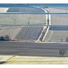
Felder
zwischen Weinfelden und Märstetten, fotografiert vom Thurberg
Comments
54


Information
| Section | Natur: 12/04 - 01/05 Raureif |
| Folders | Landschaft |
| Views | 2,981 |
| Published | |
| Language |

|
| License |
Rolf Skrypzak 15/02/2005 13:25 Voting comment
zu blass, nichts besonderes, contraMichael Resch 15/02/2005 13:25 Voting comment
ist zwar grafisch aufgebaut, aber etwas kontrastarm und im zweiten Feld von vorne ist ein unscharfes etwas, das die waagrechten Linien ziemlich störtcontra
Siegfried B. 15/02/2005 13:25 Voting comment
flaue Fehlfarben ! ? ! nee.Markus Duda 15/02/2005 13:25 Voting comment
SEHR SCHÖNE BLASSE FARBEN!P
R
O
SteveHH1965 15/02/2005 13:25 Voting comment
ein wenig zu blassskip
Thomas Solecki² 15/02/2005 13:25 Voting comment
contraWerner Braun 15/02/2005 13:25 Voting comment
proMayer Andrea 15/02/2005 13:25 Voting comment
Mir gfallts sehr gut.PRO
Günther Pichler 15/02/2005 13:25 Voting comment
skipKerstin Kühn 15/02/2005 13:25 Voting comment
Ich mag es total: PRO !!!Th. Wieland 15/02/2005 13:25 Voting comment
contraBorack 15/02/2005 13:25 Voting comment
-Thomas.T. 15/02/2005 13:25 Voting comment
contraMarcel Krüger 15/02/2005 13:25 Voting comment
1. Eindruck:..... 4 (1=Klasse .... 6=Oh nein)Motiv: ............ 4 (1=sehr interesant....6=nö)
Bildaufteilung:.. 4 (1=gelungen .... 6=misslungen)
Schärfe:.......... 4 (1=sehr gut .... 6=was ist das?)
Belichtung:...... 3 (1=perfekt.... 6=wenig zu erkennen)
Orginalität:...... 3 (1=nie gesehen .... 6=1000x kopiert)
Bearbeitung..... 3 (1=keine,schön...6=nicht gut)
========================================
Wertung:......... CONTRA (34 von 70 möglichen Punkten)
Fragen zur Bewertung? Bitte PM oder QM an mich. Danke!
Dietlinde Heider 15/02/2005 13:25 Voting comment
PRO