

Comments
17


Information
| Sections | Spezial: Minimalismus Motive: Fassaden Spezial: Color Fine Art |
| Folders | grafische Fotografie |
| Views | 5,522 |
| Published | |
| Language |

|
| License |
Exif
| Camera | ILCE-6000 |
| Lens | E PZ 16-50mm F3.5-5.6 OSS |
| Aperture | 5.6 |
| Exposure time | 1/2500 |
| Focus length | 50.0 mm |
| ISO | 320 |
Appreciated by


Embed photo
Include in a comment, a description or a message to show this image.
Link copied...
Click on the link and use the key combination "Ctrl C" [Win] or "Cmd C" [Mac] to copy the link.
Share in Messenger
Insert the following link into the comment field of the desired conversation in Messenger using 'Paste' to send this image in the message.
Link copied...
Click on the link and use the key combination "Ctrl C" [Win] or "Cmd C" [Mac] to copy the link.
Thomas Tilker 20/02/2020 15:41
...perfekt...da gibt's nix zu kritteln...VG thom
WeNoLeon 17/02/2020 21:26
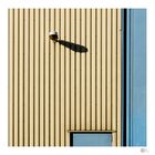
Ein blauer Beziehungsklang Ein Bildfläche unterteilende schwarze Linie , unterstützt durch die kontrastierende Flächen blau und gelb. Der Schattenwurf der Lampe auf der großen gelben Fläche setzt einen starken Akzent in das Bild! Insgesamt ein raffiniert aufgebautes Bild! Herzliche Grüße Norbert.M. Kanitz 17/02/2020 19:11
Farb - und Struktur-Kontrast passt hervorragend ins Format und die Lampe mit Schatten bringt Leben.VG Michael
abstrakt.art 17/02/2020 15:44
schöne Aufnahme.VG,Wolfgang
dabbeljubi 17/02/2020 13:49
klasse gestaltet mit fotogenen Pastellfarben...MekanikaDigital 17/02/2020 11:54
Top!Gruß Simon
christine müller 17/02/2020 11:26
Ich hätte die häßliche Lampe weggelassen.Das wirkt auch.Grüße Christine
kirbreton 17/02/2020 10:50
Wieder ein Bild genau nach meinem Geschmack.Motiv und Bildschnitt 1A
LG kirbreton
Dirk-E 17/02/2020 10:41
Sehr gut und minimalistisch gezeigt, klasse besonders in dieser Zweifarbigkeit!VG Dirk
Zina Heg 17/02/2020 10:26
Klasse Fassadengrafik! Finde ich in jeder Hinsicht super, auch wie sich das Ganze auf zwei Farben reduzier, der Schatten der Lampe...LG, Zina
Ralf Melchert 17/02/2020 9:52
Wunderbar abgelichtetAhoi.B 17/02/2020 9:38
Ein toller Bildschnitt mit starker grafischer Wirkung. Die Bildgestaltung mit den senkrechten Linien der Fassade wird unterbrochen durch die Formen der Lampe und ihrem Schatten. So kommt Leben ins Bild, was durch das "angeschnittene" Fenster in Blau noch verstärkt wird.LG Birgit
fotoGrafica 17/02/2020 9:34
der schnitt machtsgruss wolfgang
Elke B.aus E. 17/02/2020 9:18
Klasse Entdeckung.........fände es auch ohne den Türansatz gut.LG Elke