
Comments
24


Information
| Section | Motive: Architektur |
| Views | 1,513 |
| Published | |
| Language |

|
| License |
Embed photo
Include in a comment, a description or a message to show this image.
Link copied...
Click on the link and use the key combination "Ctrl C" [Win] or "Cmd C" [Mac] to copy the link.
Share in Messenger
Insert the following link into the comment field of the desired conversation in Messenger using 'Paste' to send this image in the message.
Link copied...
Click on the link and use the key combination "Ctrl C" [Win] or "Cmd C" [Mac] to copy the link.
Michael Bloch 23/10/2005 15:11 Voting comment
auch contra.Die Idee gefällt mir sehr gut nur ist das Bild aus meiner Sicht nicht gut genug für die Galerie. Auch das Bild im Bild ist mir zu wenig interessant.
also gut aber reicht nicht.
LG
Michael
Gunter Henrich 23/10/2005 15:11 Voting comment
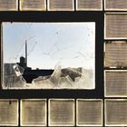
Finde das Foto sehr ansprechend, muß aber leider auch ein minus geben weil der Schnitte links und oben das ganze Bild und den Gesammteindruck zerstört.Sorry ein Minus
Gunter
Harry Hautumm 23/10/2005 15:11 Voting comment
Tut mir leid, Lucia, aber mir stellt sich hier auch nur die Frage, die bereits von Carsten Riedl gestellt wurde:Warum ein so unsymetrischer Schnitt oben und links (wobei links u.U. noch nicht einmal so schlimm wäre)
Für die Galerie leider -> contra
dein herr und gebieter 23/10/2005 15:11 Voting comment
+Das Blendwerk 23/10/2005 15:11 Voting comment
proHeinrich Morsdorf 23/10/2005 15:11 Voting comment
Tobias Brandl 23/10/2005 15:11 Voting comment
-Christof Benz 23/10/2005 15:11 Voting comment
-Der Lorenzo 23/10/2005 15:11 Voting comment
contraPaul K. 23/10/2005 15:11 Voting comment
contraCarsten Riedl 23/10/2005 15:11 Voting comment
Warum ist´s links und die obere Reihe angeschnitten?so leider ein contra
Ulrich L. 23/10/2005 15:11 Voting comment
pro !!!GREATEST HITS 23/10/2005 15:11 Voting comment
proJulia Krämmer 23/10/2005 15:11 Voting comment
pro(Don't fear) the Reaper 23/10/2005 15:11 Voting comment
+