
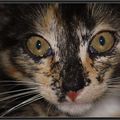
wiedermal der gute alte "Henry"
diesmal noch etwas anders bearbeitet
hier zum Vergleich die Vorgängerversion
Comments
60


Information
| Section | Natur: Terraristik |
| Views | 2,300 |
| Published | |
| Language |

|
| License |
Embed photo
Include in a comment, a description or a message to show this image.
Link copied...
Click on the link and use the key combination "Ctrl C" [Win] or "Cmd C" [Mac] to copy the link.
Share in Messenger
Insert the following link into the comment field of the desired conversation in Messenger using 'Paste' to send this image in the message.
Link copied...
Click on the link and use the key combination "Ctrl C" [Win] or "Cmd C" [Mac] to copy the link.
† Ingrid Sihler 15/08/2006 11:56 Voting comment
ProBritta Lamberty 15/08/2006 11:56 Voting comment
+++Fredrik Prince 15/08/2006 11:56 Voting comment
Schliesse mich Kathy an. Schwarz wäre besser gewesen. Contra, trotz super Schärfe und Bildaufbau.LG Fredrik
Kathy Rett 15/08/2006 11:56 Voting comment
Schade, dass du den Hintergrund angepasst hast. So etwas ist für mich eine Spielerei, die nicht sein muss. Und die Freistellung ist auch nicht sauber. Die ganzen Ränder sind zackig.Contra
Wolfgang Karl Gillißen 15/08/2006 11:56 Voting comment
proBerthold Schieffer 15/08/2006 11:55 Voting comment
+Vera Böhm 15/08/2006 11:55 Voting comment
Ein PRO für Henry!rako pictures 15/08/2006 11:55 Voting comment
+++++++++++Wolfgang Sh. 15/08/2006 11:55 Voting comment
PROHenry J. K. Mueller 15/08/2006 11:55 Voting comment
.... `nen......*~*~*~*~*~*~
....P..........*~
.......R.......*~
..........O....*~
*~*~*~*~*~*~
dafür
Rient R. 15/08/2006 11:55 Voting comment
Henry krisselt:contra
T Piechulla 15/08/2006 11:55 Voting comment
+ + + P R O + + +IngoS 15/08/2006 11:55 Voting comment
proHa Ch 15/08/2006 11:55 Voting comment
+Anja Kosubek 15/08/2006 11:55 Voting comment
+