

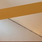
Wand und Decke
Blick auf die Decke in einem Gemeindezentrum.
Comments
14


Information
| Sections | Motive: Farben Motive: architektonische Details Spezial: Minimalismus |
| Views | 19,601 |
| Published | |
| Language |

|
| License |
Exif
| Camera | NIKON D5300 |
| Lens | 18.0-140.0 mm f/3.5-5.6 |
| Aperture | 4.8 |
| Exposure time | 1/60 |
| Focus length | 50.0 mm |
| ISO | 640 |
Appreciated by


Public favourites
Embed photo
Include in a comment, a description or a message to show this image.
Link copied...
Click on the link and use the key combination "Ctrl C" [Win] or "Cmd C" [Mac] to copy the link.
Share in Messenger
Insert the following link into the comment field of the desired conversation in Messenger using 'Paste' to send this image in the message.
Link copied...
Click on the link and use the key combination "Ctrl C" [Win] or "Cmd C" [Mac] to copy the link.
MarianneWogeck 22/09/2020 19:10
Zuerst verwirrt die Unebenheit im Putz, sie hält den Blick fest. Durch die unterschiedlichen Farben wird schnell klar, welche Ecken du gewählt hast. Prima.EstebanS 29/08/2020 18:53
Klasse Formen, ein toller Schnitt und bestens mit den Eckläufern.LG, Stefan
Silly_E 24/08/2020 15:15
ein schönes Motiv mit klarem Bildaufbau und feiner Ausleuchtung!L. G. Silly
MarianneWogeck 20/08/2020 19:25
Sehr gute Grafik.fotoGrafica 13/08/2020 9:52
raum-abstraktiongruss wolfgang
Caroluspiel 12/08/2020 11:34
spontaner Favorit.ciao Philipp.
Roland Hoffmann 12/08/2020 7:54
Es dauert, bis aus der dekorativ ästhetischen Grafik ein Sturz und eine Decke wird. Deine ganz eigene Art zu sehen eben. Gut ins Format gepackt!LG
Roland
ReimerD 12/08/2020 6:01
Du hast einen sehr guten Blick!Bestens gestaltet!
Gruß, Reimer
s. monreal 11/08/2020 21:28
Großartig in seiner grafischen Wirkung. Großartig reduziert. Der Bildaufbau gefällt mir sehr gut. Ich finde es auch und vielleicht auch gerade so "unperfekt" ausgeleuchtet perfekt. Wahrscheinlich war das Licht genau so und es wurde nichts optimiert und korrigiert. Es hat einen Gelbstich und passt somit zu dem breiten Band. Mich stört es daher nicht. Im Gegenteil: Top!VG Stephan
pfallera 11/08/2020 21:16
minimalistisch starkkirbreton 11/08/2020 21:00
Bildaufbau und Pastellfarben gefallen mir gut.Über die Bildecke links unten kann man diskutieren. Ohne die "Vignette" fände ich das Bild optimal.
Gruß kirbreton