

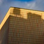
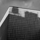
Museum Brandhorst München
Comments
19


Information
| Sections | Motive: Architektur Spezial: Schatten Spezial: 5 - Schwarzweißer Freitag |
| Views | 2,748 |
| Published | |
| Language |

|
| License |
Exif
| Camera | Canon PowerShot G7 X Mark III |
| Lens | 8.8-36.8 mm |
| Aperture | 4 |
| Exposure time | 1/400 |
| Focus length | 27.9 mm |
| ISO | 125 |
Appreciated by


Embed photo
Include in a comment, a description or a message to show this image.
Link copied...
Click on the link and use the key combination "Ctrl C" [Win] or "Cmd C" [Mac] to copy the link.
Share in Messenger
Insert the following link into the comment field of the desired conversation in Messenger using 'Paste' to send this image in the message.
Link copied...
Click on the link and use the key combination "Ctrl C" [Win] or "Cmd C" [Mac] to copy the link.
Beate Radziejewski 03/02/2024 14:57
starkes Motiv .. die Schatten verbinden sich wirkungsvoll mit den Strukturen der FassadeSCHATTENSPIEL
Beate RadziejewskiManfred Hentschke 02/02/2024 22:44
Schön mit dem Licht und Schatten.Ein toller Beitrag zum Thementag.
Gruß Manfred
Windrad
Manfred HentschkeFotobock 02/02/2024 17:42
Ein schönes Schattenspiel am Museum. Das wirkt in sw sehr gut. Lg BarbaraElke B.aus E. 02/02/2024 17:29
Klasse Ansicht......Spannung durch den SchattenLG Elke
Dalí
Elke B.aus E.waldfeecss 02/02/2024 17:00
Eine minimalistische Strukturaufnahme! In Farbe gefällt sie mir fast noch besser.LG von Constanze
Urgewalten
waldfeecssWRJFoto 02/02/2024 16:55
Die Architektur wirkt sehr spannend.GL Wolf
K. Schmitt-Rau 02/02/2024 15:54
Auch in den verschiedenen Grautönen wirkt die an sich farbig gestaltete Fassade sehr gut. Klasse auch die Licht-/Schatteneffekte. Gruß KarlheinzHageFoto 02/02/2024 15:32
Eine klasse Ansicht der Fassade!LG Hans-Georg
Bodennebel
HageFotoKurt Stamminger 02/02/2024 8:15
Spaziergängerin
Kurt StammingerSchlicht und gut. LG Kurt
Zerwonke 02/02/2024 7:58
Die Farbversion find ich einen Ticken besser.Gr au B
Alfredos click 02/02/2024 7:55
Die Licht&Schatten Ansicht verleiht dieser Fotografie in SW einen sehr Künstlerischen Anblick.LG von Alfred.
Ungeschminkt*
Alfredos clickLaufmann-ml194 02/02/2024 6:18
Die Formensprache der Fassaden erinnert an das untergegangene WTCvfgm194
Übergrifflichkeiten
Laufmann-ml194Reinhard D. L. 02/02/2024 4:00
die fassade macht auch in s/w eine gute figur.gruß
Reinhard
Pompeji und Igor Mitoraj
Reinhard D. L.cabrio2 02/02/2024 0:08
Sehr guter s/w Beitrag, GeriIch wünsche dir ein schönes Wochenende, lg Anton
magic-colors 02/02/2024 0:00
Warum kippt das Bild so stark nach rechts, war das so gewollt?Ja, die Schatten sind beeindruckend.
Liebe Grüße aNette
Sacré-Cœur de Montmartre
magic-colors