

Kontrolle ist besser - 2 -
noch einmal in Farbe
Comments
16


Information
| Sections | Motive: Stadtlandschaft Motive: Reportage / Dokumentation Motive: Streetfotografie ohne Menschen |
| Views | 5,962 |
| Published | |
| Language |

|
| License |
Exif
| Camera | NIKON Z 6 |
| Lens | Nikkor Z 24-70mm f/4 S |
| Aperture | 8 |
| Exposure time | 1/160 |
| Focus length | 70.0 mm |
| ISO | 100 |
Appreciated by


Public favourites
Embed photo
Include in a comment, a description or a message to show this image.
Link copied...
Click on the link and use the key combination "Ctrl C" [Win] or "Cmd C" [Mac] to copy the link.
Share in Messenger
Insert the following link into the comment field of the desired conversation in Messenger using 'Paste' to send this image in the message.
Link copied...
Click on the link and use the key combination "Ctrl C" [Win] or "Cmd C" [Mac] to copy the link.
Thorsten aus Berlin 14/08/2020 11:53
Du hast ja einen wirklich guten Blick für Motive. Werde dir wohl folgen müssen damit mir nichts spektakuläres entgeht :-)Storchi 03/08/2020 14:08
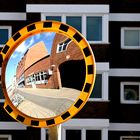
Ein schöner Farbkontrast, auch der Gegensatz Rund-Eckig kommt hier GUT.Ich hätte aber links die senkrechte Kante noch weggeschnitten.
Gruß, Storchi
cremerandreas 01/08/2020 21:09
Ich finde die Version in Farbe besser. Hier sehe ich den Kontrast zwischen monochromer, weitgehend rechtwinkliger Hintergrundarchitektur (unscharf) und farbiger Spiegelung mit gebogenen Konturen. Dadurch wirkt das Bild für mich lebendiger. Allerdings passt die schmale rote Kante links nicht so recht dazu. LGAndreas
Fritz Naef 01/08/2020 11:05
!! LG FritzCaroluspiel 31/07/2020 14:40
Für mich in SW.ciao Philipp.
Thomas Tilker 31/07/2020 13:55
...auf jeden Fall in Farbe!VG Thom
Hans Jürgen Schmidtjever 30/07/2020 21:36
Du kamst leider nicht ins Bild!Gruß von Hans Jürgen
s. monreal 30/07/2020 16:06
Wirkt schön. Die farbige Version ist besser gelungen.VG Stephan
Daniel 19 30/07/2020 15:30
Mir als Altbunter gefallen die farbigen Versionen meist besser. Das ist auch hier so. LG DanielSteffen Mahler - mopped-man 30/07/2020 13:54
Die Farbvariante ist auch mein Favorit. Hier kommt das Leuchten in der Sonne vor dem schattigen Hintergrund viel besser zur Geltung.LG Steffen
Matthias Polakowski 30/07/2020 12:43
Ich denke, dass mir die Farbvariante besser gefällt.Geri Barreti 30/07/2020 12:43
in diesem Fall gefällt mir mal die farbige Variante besser!Ralf Melchert 30/07/2020 12:35
Klasse entdeckt und festgehaltenBernd Tasler 30/07/2020 12:17
:))