
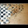
~~~ K ~~~
The Wall
Vgl. auch

~~~ K II ~~~
Klaus F.
Comments
10


Information
| Section | Natur: Wald |
| Views | 634 |
| Published | |
| Language |

|
| License |

Thomas Schlier 29/01/2005 17:04
Die Lichtflecken machen sich echt gut!Mir gefällt diese s/w besser als Farbe.
Viele Grüße, Thomas
Trautel R. 29/01/2005 8:16
Das hat eine sehr gute grafische Wirkung.LG Trautel
Alfred Richter 29/01/2005 7:51
Besonders gut sind die unterschiedlichen Lichtverhältnisse auf dem Baumstapel, heraurrausragend das "K" als zusätzlicher Blickfang.Grüße
Alfred
el len 29/01/2005 1:18
Das ist ja echt ein wirklich starkes Motiv ... auch wenn es für mich nach Farbe geradezu ruft! Aber schön trotzdem!lg ellen
Dagmar Kesting 29/01/2005 0:03
und dann das "K"...das bild kannste dir ja fast an die klingel montieren.
Ray B. 29/01/2005 0:01
Da liegt ja ein halber Wald, aber sieht gut aus!vg alfred
Angelika H. 28/01/2005 23:18
hat was plakatives.wirkt sehr grafisch.
und deshalb finde ich es gut.
lg angelika
die Maike 28/01/2005 23:07
genau, irre graphisch, die ehemalige Natur!lg, Maike
Dagmar Kesting 28/01/2005 21:24
tolle grafische wirkung.und der himmel macht das ganze zu einem monument.
Micha Z. 28/01/2005 21:19
Das nenn ich mal eine menge holz vor der hütte ;-)