
Comments
94


Information
| Section | Spezial: Color Fine Art |
| Folders | Randgebiete |
| Views | 32,681 |
| Published | |
| Language |

|
| License |
Exif
| Camera | Canon EOS 5D Mark II |
| Lens | --- |
| Aperture | 18 |
| Exposure time | 1/20 |
| Focus length | 24.0 mm |
| ISO | 100 |
Appreciated by


Public favourites


Embed photo
Include in a comment, a description or a message to show this image.
Link copied...
Click on the link and use the key combination "Ctrl C" [Win] or "Cmd C" [Mac] to copy the link.
Share in Messenger
Insert the following link into the comment field of the desired conversation in Messenger using 'Paste' to send this image in the message.
Link copied...
Click on the link and use the key combination "Ctrl C" [Win] or "Cmd C" [Mac] to copy the link.
Sonnja S. 12/01/2024 10:42
feine Komposition von Fläche und Farbelg sonnja
bänu 07/02/2020 18:17
starkOliver Oster 05/03/2015 23:26
Dankeschön …… an ed gonzales dass er dieses Bild für die Galerie vorgeschlagen.
… an alle die sich an dem Voting zu diesem Foto beteiligt haben und insbesondere an jene die mir mit ein paar Zeilen zu erkennen gegeben haben, dass sich nicht nur schnell mal klicken sondern das Bild auch betrachtet haben und meine Art zu fotografieren anerkennen.
… für die nachfolgenden Besuche und Kommentare auch bei meinen anderen Bildern
Ernesto Ste Obscura 04/03/2015 16:13
Ich häng das mal auf!Die alternative Galerie112 (geschlossen)
neniraklg Ernst
Astradyne 03/03/2015 19:55
… wollt' ich auch gerade schreiben ;-)Matthias von Schramm 03/03/2015 11:45 Voting comment
Siegfried, gestern um 11:58 Uhr
andreasinKN@ Wenn ich fotografiere drücke ich nicht xbeliebig auf den Auslöser, nei ich schaue auch in den Sucher und wähle ein Motiv
aber du gibst dir reichlich mühe, dass es so aussieht. erstaunlich ;)
Harpagornis 03/03/2015 11:45 Voting comment
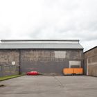
Pro.Mein erster Eindruck: Was soll das? Erst beim zweiten, dritten Mal hinschauen erschloss sich mir das Bild. Die klaren Formen und Farben mit einem Hauch von Minimalismus. Wohlüberlegt und gut beobachtet reiht sich dieses Foto aufs Vortrefflichste in die anderen Arbeiten des Fotografen ein.
Heiko Hoffmann 03/03/2015 11:44 Voting comment
man sagt es allgemein - das Foto hat Witz und unbestreitbar Qualitäten, daher auch von mir pro† werner weis 03/03/2015 11:44 Voting comment
spricht zu uns
PRO
Wörn 03/03/2015 11:44 Voting comment
Der Titel gibt dem Bild erst den richtigen Witz. Der kleine Rote hatte sich wohl etwas zuviel vorgenommen. Dann noch klare Farbgebung, ein passender, ruhiger Bildaufbau... Ich finds sehr pro.Karl Kühn 03/03/2015 11:44 Voting comment
+Insulaire 03/03/2015 11:44 Voting comment
-Lucifer 77 03/03/2015 11:44 Voting comment
+++FunX 03/03/2015 11:44 Voting comment
cKi.mar 03/03/2015 11:44 Voting comment
** PRO **grüße kim .. ;-)