
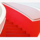
Bibliothekstreppe
Campus Heilbronn
Comments
23


Information
| Sections | Motive: Treppen und Treppenhäuser Spezial: Color Fine Art Spezial: Minimalismus |
| Folders | Heilbronn |
| Views | 11,953 |
| Published | |
| Language |

|
| License |
Exif
| Camera | ILCE-6500 |
| Lens | E 70-350mm F4.5-6.3 G OSS |
| Aperture | 5.6 |
| Exposure time | 1/30 |
| Focus length | 70.0 mm |
| ISO | 250 |
Appreciated by


Public favourites

Embed photo
Include in a comment, a description or a message to show this image.
Link copied...
Click on the link and use the key combination "Ctrl C" [Win] or "Cmd C" [Mac] to copy the link.
Share in Messenger
Insert the following link into the comment field of the desired conversation in Messenger using 'Paste' to send this image in the message.
Link copied...
Click on the link and use the key combination "Ctrl C" [Win] or "Cmd C" [Mac] to copy the link.
MarkKoch 31/03/2020 20:54
Stark!kirbreton 06/03/2020 0:49
Sehr starkes Bild. Mein Kompliment.Gruß kirbreton
fotoGrafica 02/03/2020 16:36
farb-grafisch gelungengruss wolfgang
Ahoi.B 02/03/2020 11:00
Schwungvoll, dynamisch und aufstrebend wirkt diese Darstellung der Treppe. Mir gefällt die rote Fläche, welche durch die Treppenstufen unterbrochen wird - so wirkt es sehr räumlich. Es stimmt, dass das dunkle Dreieck fast als Blickfang wirkt - aber mich stört es nicht, da es als Begrenzung der runden Form wirkt und auch durch das graue Dreieck unten ergänzt wird..LG Birgit
Dirk-E 02/03/2020 10:37
Ein prima Hingucker!VG Dirk
christine müller 02/03/2020 8:38
Gern würde ich dort einmal hoch gehen oder runterschauen.Super Foto,ja rote Ecke,aber ohne Makel wäre es sicher nicht so"rund"Grüße Christine
cremerandreas 01/03/2020 21:12
Ich finde die Form des roten Bereichs ausgesprochen inspirierend (auch wohltuend, dass die Form nicht schon wieder in die Ecke läuft). Leider stört mich das dunkle Dreieck am rechten Rand etwas und ich wünschte, es wäre auch ohne gegangen. Trotzdem ein schönes Bild. LGAndreas
Zina Heg 01/03/2020 13:12
Eine geniale Reduktion auf Formen und Farben finde ich das... top!!LG, Zina
Caroluspiel 01/03/2020 10:34
TOPciao Philipp
Werner Sperl 01/03/2020 8:00
Einfach NUR GUT !!!!!!!!!!!!!!!!!!!!!!!!!!! Tolles Motiv!Frank Oliver Barth 29/02/2020 21:16
Starker Farbkontrast und toller Bildschnitt!VLG Frank
WM-Photo 29/02/2020 19:21
Klasse.Gruß Walter
Silly_E 29/02/2020 18:50
schön geschwungen in knalligem Farbkontrast gezeigt!L. G. Silly
aosa 29/02/2020 18:49
!!!!!sonnenlicht 29/02/2020 18:29
super!!!Erinnert in der Vorschau an einen Karnevalshut. ;)
vG