

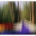
Fashion of spring
Keukenhof, Netherlands
Canon F1n, 210mm, 81B warmup filter,
3 stop ND grad moved in from above, for better balance in the overall exposure,
film Kodak Portra 160VC
Comments
18


Information
| Section | Nature: Flowers |
| Views | 2,690 |
| Published | |
| Language |

|
| License |
Embed photo

Include in a comment, a description or a message to show this image.
Link copied...
Click on the link and use the key combination "Ctrl C" [Win] or "Cmd C" [Mac] to copy the link.
Share in Messenger
Insert the following link into the comment field of the desired conversation in Messenger using 'Paste' to send this image in the message.
Link copied...
Click on the link and use the key combination "Ctrl C" [Win] or "Cmd C" [Mac] to copy the link.
dyahna 26/04/2007 22:20
tulpen uit amsterdam...love it !!!!
When 23/04/2007 8:05
Nice dof.Maria Kyselicova 19/09/2006 18:42
ah...:-))tulpen...meine lieblingsblumen...schoene farben, atmosphäre und schärfeverlauf...
maria
Anastasiya Ivanova 29/06/2006 9:41
Oh just a very beautiful one! The background colors are charming as well!I like this work, well done!
Anastasia
Robert van der Sanden 19/05/2006 20:06
Certainly, I value that a lot. Different opinions are more chalanging for the mind and a better learning experience.Detlef Klahm 19/05/2006 20:03
I always felt that hearing different opinions we can built on our own strength...not that we have to agree with comments, but to realize which way works best for us.Take Care !
Robert van der Sanden 19/05/2006 19:58
@Laki: The out-of-focus behaviour (=bokeh) of this lens is pretty good, although I would prefer an even softer blur circle especially where the highlights on the leaves of the trees create these disks, that I find a little distracting.@Detlef: thanks a lot for your constructive comment. With the strongly blurred red blobs in the foreground I tried to create a layered picture, to give more depth where the foreground is not neccesarily the layer of interest. Although these blurred tulips in the front are pretty dominant I have the idea that they don't really pull the attention away from the tulips that are sharp. Without them the bottom of the picture would have been blue, which is also a pretty dominant but distracting color. For me the red blobs give a more solid base to the compotition that, because of the same red, is more in balance with the rest.
I agree with you about the background. Although I already used a strong ND grad the reflections on the distant leaves are still a little bright. I will try some selective darkening on my PC.
It's interesting to hear your different opinion about this picture and I really appreciate that you share it with me.
Greetings,
Robert
Detlef Klahm 19/05/2006 14:29
Lighting on the tulips works well to define them, seperate them from the background. but I find the totally out of focus forground very distracting . I would have prefered not to have the sky in the background. keep your image simple..look for coloures that work well together to give impact and avoid foregrounds which are out of focusLaki K. 14/05/2006 21:00
vivid colors and fantastic bokeh, great againcheers
laki
Robert van der Sanden 14/05/2006 19:51
Thanks for your nice words. That backlight was only there for a short time. A little later the sun disappeared behind a big old tree. Without it, this picture would have had less impact. I guess I was lucky to be at the right place at the right time.Greetings,
Robert
Carlos Santa Maria 14/05/2006 17:09
Fantastic compostions and colors. I love the lighting effect on the tulips. Cheers.Esti Eini 13/05/2006 8:51
The abundance of colors in the background and the light that falls directly on the flowers in the foreground makes it especially vivid and beautiful.Frank Terlien 12/05/2006 23:31
erg mooie kleuren compositie....Robert van der Sanden 12/05/2006 23:27
Thanks for the applause. Makes me blush :-) This shot made my jeans muddy in the wet grass but it was worth it...Robert
JVision 12/05/2006 22:06
Wonderful work Robert !! Good idea to meet next year in the Keukenhof.Greetings
Jutta