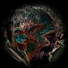
the Collective (revisited)
Another in a string of revised versions of older pieces. I still am torn about tampering with older ones on principle, but I did a period of these last year as well, and the results were greatly improved versions of ones that may have suffered under a less experienced hand or sloppy edits. I don't intend to do this indefinitely, but as this piece is a year old now and I am a better editor now than I was then, this one needed some issues addressed that bothered me since it was completed.
"the Collective" was, at the time, a hard piece to complete. It was my first "clone" piece, and it was created spontaneously, no plan about what I was making prior to starting it. It did well for me; it's a popular one and it was runner up in a photography competition.
But, there were a few things that I didn't like about the final product, mostly due to the improvised editing and some techniques that were a little rough a year ago and have improved since then. The biggest issue was the crop - just too tight, the floating hat right up against the top edge of the image, his feet right up against the right. It felt claustrophobic and cramped, and this was due to the fact that I wasn't planning on having a hat floating above his head in the first place, and once I did, I knew no way to shrink and reposition the original image and expand the frame of the composition. The other aspect I wasn't pleased with was the color choices - a sickly green/yellow pallor over all. Not sure what it was at the time, but I did the green/yellow a lot back then; it was the reason for my last revision too.
Once these two issues were addressed, I decided to re-think two symbolic aspects of the original. "The Collective" is about the collective subconscious, the experience of ideas shared despite no apparent contact between the disparate parties. We see it in media, we see it entertainment, and I see it all the time in art photography, though some of that is clearly copycat syndrome. In the original, I had three strings coming out of the foreground man, to imply the path of thoughts or ideas. The clones had one string entering their heads, to imply receiving the information. In the sky, three stars were visible, in the same pattern of the men below. This was to suggest that the entire universe plays a part in the collective subconscious. These choices were fine for what they were, but the stars were a little soft and blurry, and the strings, well, they were badly placed and arranged, and weren't the best choice for a transmission metaphor. So, small antennae were used here instead, and three red balloons are floating in the sky now, a reference to my "Red Balloons" series from last year, and it gives me another reference of three, since the stars are now gone.
Lastly, the texture overlays were greatly reduced - I am working with less of them now, and a year ago, they were used largely because they helped hide some rough edges underneath. This is another benefit of improved editing skills - you don't have to hide as many things with a complicated composite.
I hope you like the revised version, and it's fine if you prefer the older one - I do not intend to do this to every single older one - just the ones I thought were a good idea to begin with that deserved better than they originally received.
A side by side, old/new version of this image can be seen on my Facebook page at:
https://www.facebook.com/media/set/?set=a.482997591774229.1073741825.281328851941105&type=3
Model: Ed Barron


Karl Klanke 06/10/2013 18:56
how nice!Karl