

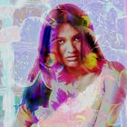
experimental...
Another experimental image....please let me know if it works or not.....if it 'resonates' in any way....or not......I need some feedback here from others....thanks.....
Comments
6


Information
| Section | Digiart: Digital editing |
| Views | 2,273 |
| Published | |
| Language |

|
| License |
Embed photo
Include in a comment, a description or a message to show this image.
Link copied...
Click on the link and use the key combination "Ctrl C" [Win] or "Cmd C" [Mac] to copy the link.
Alexandru Valentin Iedu 02/09/2008 22:53
Really nice play with colours and forms ...Greetings from Romania,
Alex
Jeff Burgess 02/09/2008 22:50
Thank you all....you have no need to apologize for the criticism. In fact it is important if I am to grow as an artist. It is all very much appreciated and has given me pause......Sometimes it is difficult to offset color vibrancy with an image. I go from dulling down images....a technique that looks good when printed....sort of 'print like' to extremely 'over-colored' pieces. Part of my problem is that I do not have a properly calibrated monitor....
MWPhoto 02/09/2008 20:05
The impression I get is middle-eastern - "Persian" to be more specific. Probably because of the treatment of the hair, which suggests a shawl, as well as some of the "arabesques" and flowers that I see in the background. Maybe I am influenced by my recent fairly tale reading, but this image shouts "Schaherazade" to me (a strong and intelligent young woman who triumphed over the capricious king).Filters can be a two-edged sword (I usually overdo it, to the detriment of the photo), but in an image like this, with a single strong element (less dependent on photographic "realism" for its impact), the effects provide an interesting "backstory". And I like the colors - the vibrancy matches the strong, frontal pose. I might have decreased the contrast on the facial skin somewhat ... but I am seduced by youth (sigh).
Not sure if that's where you were going, Jeff, but that's how it strikes me - middle-eastern fairy tale: caravans, genies, princesses, lotus blossoms and all the rest :)
Pahsophist 02/09/2008 15:56
Yes, I agree about the colors. The face on this model seems to call for darker more extreme colors to match the apparent mood.Véronique Soulier 02/09/2008 8:38
Another good work even if I prefer the other one but it's really just a matter of taste, the BG is good maybe the face a bit too near of a pic or too white parts, just my two cents.. bye VSJohn LePage 02/09/2008 4:37
Again I am liking the concept here but the colors are not appealing to me.