
Bottles
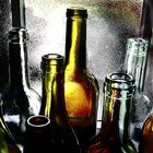
A bit of Photoshop applied to some empty bottles - any thoughts?
Comments
5


Information
| Section | Subjects: Critique - straight and tough |
| Views | 826 |
| Published | |
| Language |

|
| License |
Embed photo
Include in a comment, a description or a message to show this image.
Link copied...
Click on the link and use the key combination "Ctrl C" [Win] or "Cmd C" [Mac] to copy the link.
Jaime Crystal Attenborough 09/01/2007 0:11
the crop is to tight, i think maybee you should of photographed the whole Bottles bottom and top to give the photo more balance, looks a bit weird just the tops of themgreat colours, but to much PS think, great how you have used the light from the window also
J
Alfred Spectrum 08/01/2007 5:16
Nice, I like the hard contrast.Robyn Raggio 01/01/2007 22:20
The high contrast enhances the volume and form of the bottles with interesting highlights and deep rich blacks. The color is rich and dense and gives a graphic quality to the image when combined with the contrast. Stippling of moisture on the glass adds interest to the large expanse of translucent area and helps with the hotter spots.Wim Denijs 31/12/2006 13:09
nice colours , nothing to add , good picture !!!Ionut D 29/12/2006 23:40
good work, no comment,but I don't get it if all the bottles are perfectly vertical ...