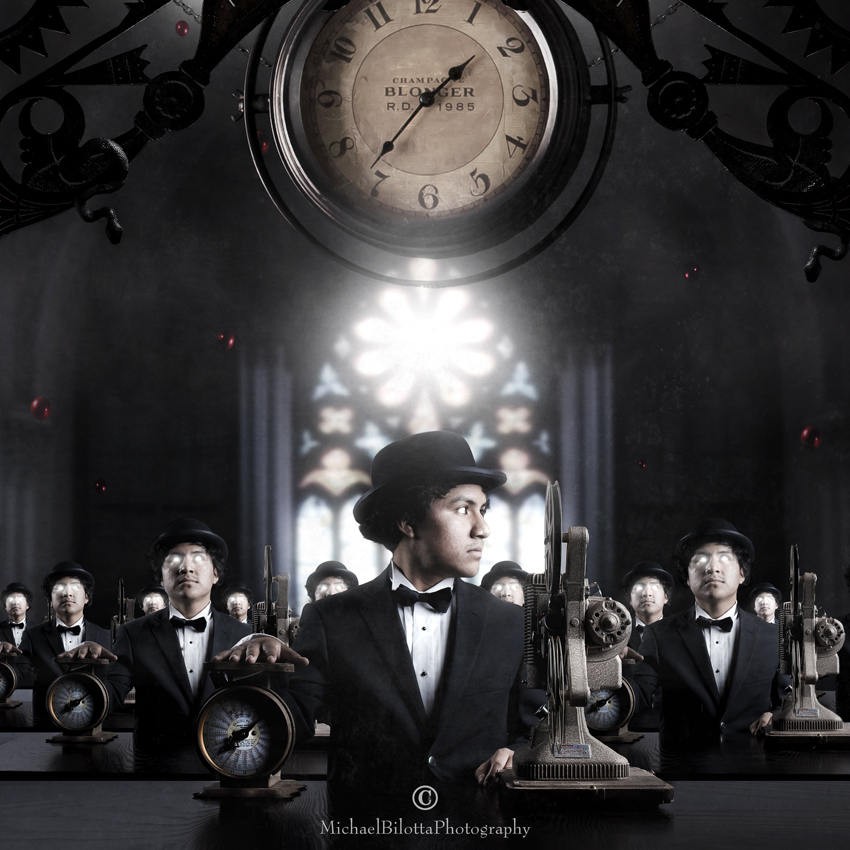
the WorkForce (revisited)
This is one of the older ones that I've been meaning to revise but dreading it at the same time. It was complicated a year ago, it's even more complicated now. So many layers. One of the hardest ones I worked through a year ago, and now, one of the hardest revisions to complete.
What is the old adage? "If I knew then what I know now…"
Very true, and my approach to layer masking a year ago was a lot sloppier and chaotic than it is now. This is a clone shot. One foreground image, and a variation of it cloned multiple times behind him. Except, I stacked the clones on top of the foreground, and painted out the excess. Back then, I was not using a Wacom tablet, so the masks were sloppy, but easy to hide the rough edges with my washed out sky of the original. Dark backgrounds are notoriously difficult to mask over hair lines and such. I basically had to strip away everything but the group of clones to do this one over again, and try to massage the layer masks of the group as best I could.
And what is the real impetus for doing this shot over again? The original did well for me; it is one of my most stolen images online. A couple inquiries have come asking to use it for album art. It was one of my most popular a year ago. But…
This workforce should have been indoors. There is no reason for clouds, sky, and a floating clock and visible moons in this concept. The reasons they were there are twofold: one, the moons and clock are symbolic: the waxing and waning moons represents youth to old age working the job, working your life away. The clock, large as it is, is symbolic of the time driven working world, ruled by the almighty hour. Two: I did not have a way of building an indoor environment suitable for the shot back then.
So, it was a compromise of lack of resources and a little bit of laziness or impatience that led me to the final version as it was a year ago. Honestly though, interior composites are a lot harder for me than outdoor ones: you need straight lines, dimension, proper scale, and for my process, I need individual components that could marry into one: walls, floors, ceilings, windows, architectural features. My aesthetic preferences lean towards classic or antique in my imagery, and finding raw components for interiors has been an ongoing challenge to say the least.
But I was determined to give this image a cleanup, and put these men indoors, so I did. The background was a church interior I shot last year, which needed to be beaten into pixel submission to line up properly, overcoming some parallax distortion and angles. The depth of field blur had to be simulated. That gave me a workforce in the foreground in sharp focus, and a soft background. I needed something on their plane to give it some depth. The clock, a newer one, more ornate, was once again placed central, and I used a door frame art deco bracket I bought at an antique store to create some architectural buttresses above, merging with the clock.
Since this was part of the "Red Balloons" series, they needed to be back there, but more subtly this time. The balloons, as they do in the other images in the series, represents youth and innocence slipping away. Certainly the cold water reality of the daily grind does a good job at squashing our childhood right out of us!
I did add one new element in. They're blended into the overhead beams so you may not see them, but there are two snakes watching over the workers. As I am about to be unemployed from my own office job or horror, certainly the presence of snakes is one I can attest to - the symbolism needs no explanation to those who work in these environments. If you don't, trust me, the snakes are always there!
Lastly, I once again veered away from last years predominant color choice of green. It is indeed my favorite color, but this image and its concept did not need a verdant warm color, it needed icy cool tones, to make the bleak environment of the office drudgery resonate visually. That big window in the back may be beautiful and flooded with warm light, but it is out there, and the workers are inside, and by the time the clock strikes 5 o'clock above them, the sun will be gone, and they will go home in darkness, missing the daylight altogether, while they toil away at their repetitive tasks.
My opinion about the modern office environment and the jobs within has been pretty consistent for most of my adult life. I have never been able to make an adequate living being an artist, so far anyway, and since age twenty, I have been in one office job after another. The work I do is dull, ill-suited for me, and the days are too long. Eight hours, five days a week may be the norm, but it is too much a slice of your conscious hours, too much of the week, and two days on the weekend and two weeks a year for vacation is still an egregious imbalance. There are days where I can barely tolerate it, days where I feel like running out the building. I know this is not a unique feeling, but hard to take when your work is not what you love, not what you'd rather be doing, not your choice, and consumes most of your energy, leaving you with a few hours to try to kindle the dying flames of your real life.
Since this is a fairly extensive revision, I have two Before and After versions on my Facebook page: one showing the old and new version side by side, and the other showing the revised version during and after construction. Please go to: www.Facebook.com/MichaelBilottaPhotography
Model: Gilberto Mendez


Carlo.Pollaci 11/01/2014 9:48
Creativity and imagination: the big picture!greetings,
Carlo
Joachim Aniol 09/01/2014 20:04
Herzlichen Glückwunsch zum Stern.FG Joachim
KLAAS H 09/01/2014 13:59 Voting comment
+Terje Nicolaysen 09/01/2014 13:59 Voting comment
proHerr M 09/01/2014 13:59 Voting comment
+-Maurizio Moroni (UKPhoto) 09/01/2014 13:59 Voting comment
Pro!Niccolo Dossarca ( oder auch u.a. JürgenStrötgen oder js ode 09/01/2014 13:59 Voting comment
proLawson McCulloch 09/01/2014 13:59 Voting comment
proCanan Oner 09/01/2014 13:59 Voting comment
ProRuth U. 09/01/2014 13:59 Voting comment
probobby14 09/01/2014 13:59 Voting comment
PRO**winkel 1 09/01/2014 13:59 Voting comment
proAlexander Dacos 09/01/2014 13:59 Voting comment
PRO***Jochen Braband 09/01/2014 13:59 Voting comment
PRO!!!Gasser Lisbeth 09/01/2014 13:59 Voting comment
+++PRO+++